Friday, 27 February 2015

Task 1 - The Purpose of Concept Art

Purposes Types Of Concept Art

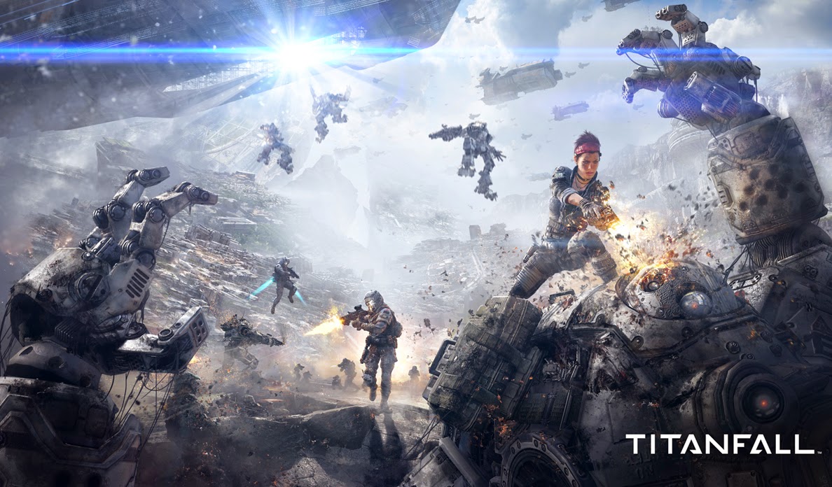
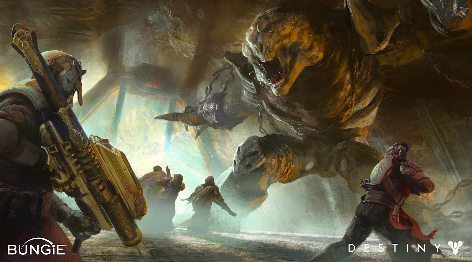
Concept art is seen in different ways but there are mainly only 3 ways concept art is used in the industry.

The first purpose of concept art used in the industry is that it is quantity over quality which is where an artist will draw as many rough ideas as possible based around one brief so that there are many options to choose from. The artist won't spend too long on one idea during this stage because if that idea was rejected then that would have been wasted time spent on a very detailed drawing rather than another 5 quick sketches which could have included the right one. Being creative and quick is essential during this stage because as soon as you get the assignment brief then you need to generate multiple ideas in your head and jot them down anywhere possible. I feel that it would be the best to draw like one or two which are similar but trying to think outside the box is great as it makes that character unique and gives many options to choose from.
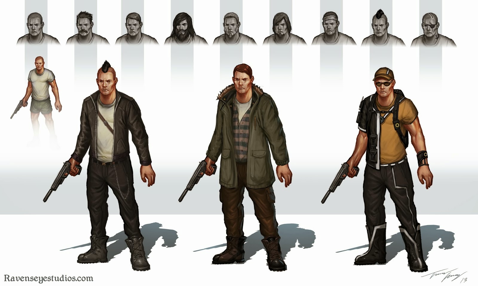


The second purpose of concept art is when a few of the initial ideas are chosen by the lead artist (4-5) and then these drawings are worked on and developed even further with quite a lot of detail so that they can be taken to the partners and publishers for them to approve of the idea that they like the most or which ever they feel would suit their game the best. The developed drawings will have annotations describing this that you can't necessarily visualize and will be draw with a front view, side view and back view so that the publishers can see what the entire character will look like.
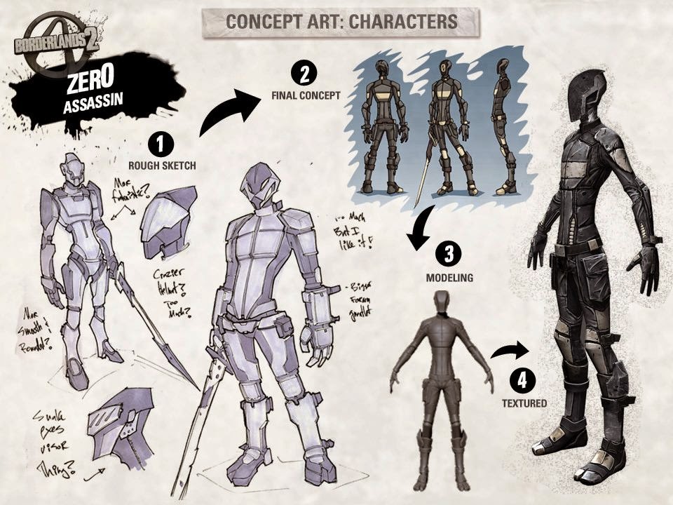
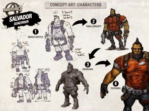


Finally, once the publishers and partners have chosen the character that they like the most and then this drawing will have the full attention of the artist to be drawn, coloured, shaded and modeled to perfection to be exactly what would be in the game that is going to be released. After the artist has completely finished this hand drawing of the complete character then this will be transferred to be digital using a professional tablet and pen. Once this is done this character is used on things such as posters to advertise the game by giving the public an idea of what the finished game will be like and it is also used to build hype for the game.


Thursday, 26 February 2015

Task 2 - Mark-making Portfolio


Anatomy 


Blindfolded - 4 minutes
Coloured marker pen.
Look at my partner and then attempt to draw them blindfolded.


Cheesy Smile - 4 minutes
Biro pen.
Draw a face portrait with the smile spreading across the whole page.


Don't Stop - 4 minutes
Coloured marker pen.
Draw a full face portrait covering the page without taking the marker off the page.


Eye See - 4 minutes
Three coloured marker pens(light to dark)
Draw a close up of my partners eye in detail.


Exaggeration of the feet - 15 minutes
Pencil 
Sketch a full body portrait of my partner but exaggerate the feet. 


Freehand - 8 minutes
Biro pen
Draw a face portrait of my partner using any art style I choose.


Full face - 4 minutes
Biro pen 
Draw a face portrait of my partner using my non drawing hand.


Exaggeration Of The Hands - 15 minutes
Biro pen
Draw a portrait of your partner in this position but exaggerate the hands. 


Laying Down Pose - 20 minutes
Pencil 
Sketch a detailed portrait of your partner laying against the table.


Hot and cold - 4 minutes
two coloured marker pens (hot and cold)
Draw only using shapes or blocks.


Tone - 4 minutes
Coloured marker pen (dark)
Draw only the shadowy areas of your partner using no lines.


Tonal Face - 4 minutes
Biro pen
Only use vertical and horizontal lines.


Environments


                                                  Single-point perspective of the letter "M".
Pencil


Two-point perspective of the letter "X".
Pencil


Three-point perspective of the letter "H".
Pencil


Two-point perspective of a space station from found imagery.
Pencil/Biro Pen


Applying the one point perspective to a city scape.
Pencil/Biro Pen


Objects


Produce a series of 4 close up tonal observational studies
of model made out of paper meeting the following themes:
Tied
Twisted
Curled
Folded.
Pencil/Biro Pen


Manmade Detail - 
Produce a series of detailed studies of close-up of four of the following:
A Watch
Shoelaces
Door Hinge
A Zip Pull
Piano Keys
Vending Machine Controls
Plughole
Radiator Tap
Light Fitting
Pencil/Biro Pen

Visual Communication/Presentation


How to guide:
Create a guide that explains my activity using only images
NO Words
Activity Chosen:
Tie a bow tie.
Pencil/Biro Pen


My day until 2:25pm
Draw a series of images from my memory/imagination 
of my day at the following times:
Waking up
Eating breakfast
Travelling to college
First Lesson
Lunch
Second lesson.
Biro Pen


Wednesday, 25 February 2015

Task 3 - Concept Art Style Profile

The specific concept art style that I am going to focus on is cel shading because I find this cartoon style of drawing to be visually pleasing. Another reason why I have chose this is because I feel that you can do a lot of exaggeration when drawing in particular style as things don't have to have logic, look real or obey the laws. With this choice I can let my imagination go wild and just draw anything that I feel like. However if I was to have chosen the photo realistic concept art style then my character, environment and objects would have to look real which in most occasions can look boring as it's nothing new or exciting.

Jet Set Radio:
One game that uses this style is the game Jet Set Radio which is a game about rollerskating as your transport while you do tricks, missions and challenges throughout. From this concept art we can see that the characters hands and feet have been exaggerated to look quite large which isn't a bad thing as doing sch things makes this character different to others. This is possibly only one idea for this character as it is a rough sketch and the artist is just jotting down as many ideas as possible whenever he thinks of them.  


 The environment in Jet Set Radio is also drawn to be very cartoon like however it can look bland at times even though there are many colours each building is basically a coloured box with no exterior design or flare added to them. When creating my environment I would most likely stay away from doing something like this as I just don't personally find it interesting.


Borderlands 2:


 The characters from Borderlands 2 have quite a cartoon look to them but they are also realistic in a sense but would give me room to make somethings look exaggerated or silly. The concept art I am looking at shows me that from the initial idea the designers didn't stray too far when coming up with different ideas for what this character could look like. However there are a lot of ideas to choose from that have most likely been drawn in a short amount of time.

The weapons in the borderlands games have always been outgoing, fun and extremely colourful which I really enjoy about this weapons, you can go over the top and create any sort of weapon you want. When creating a weapon like this you can just let your imagination go wild. 


The Legend Of Zelda: Wind Waker:

The environment in this game is very smooth, bright and colourful which is a really good thing as it makes the game incredibly visually appealing but for me the art style is a bit too much like a cartoon.
In this rendition of The Legen Of Zelda they have chosen to use the cel shaded art style for the main character Link and my opinion is basically just the same as the environment, the character is more child friendly and approachable but not the particular art style that I want to use for my project.   

Tuesday, 24 February 2015

Task 1 - Sources of Ideas

I have chosen to create a character, weapons and an environment for the game Borderlands 2 as this is a game which I have experience with and I really enjoy the freedom and look that comes with their particular art style.

Character Into Screens:


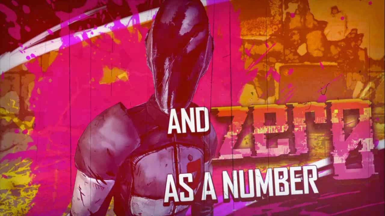
In borderlands whenever a new character, NPC or boss is introduced they always have this brief into screen where it shows the character, their name and then often has a little saying that describes them or is there to entertain the player. I feel that I will have to do this for my character once I have a final design and name ready.

Weapons:


The weapons in this game are extremely varied with each weapon having its own distinct look with colours, styles, writing, damage type. The weapons are also exaggerated as these are weapons that will likely never be made real as they are just too crazy. 


Monday, 23 February 2015

Task 2 - Development Studies for Character, Objects and Environment

These are my initial ideas that I drew for my character design expressing every option that I could think of with notes to help me visualize how my character would act/look like in the gaming world of Borderlands 2. From the outset I decided that my character would be a demolitions expert which immediately put many ideas into my head of what he could possibly look like. I will now talk through each design that I drew and why I chose these certain ones.

1.  The first idea that I thought of was someone that was incredibly angry for no apparent reason but didn't stray too far away form looking like an ordinary human. I decided to add an eye-patch onto this character because I did't want his face to just be plain and I did want to add a scar to his face but decided to take it that one step further and show that his eye has been badly damaged due to an unknown accident.

2. For the second character I chose to go away from the human side of things as every playable character is a human so I felt that I should change this and designed a wolf like character that had been branded with the Borderlands symbol which means he would be there for revenge on the person who did this to him (Handsome Jack).

3. For this 3rd idea I went in the direction of a steam-punk themed character with a long white beard and goggles that would protect his eyes. I thought that this was a good idea in my mind but when actually drawing it on paper it looks more like a medic rather than a blood-thirsty demolitions expert. Compared to the others this one just stands out for all the wrong reasons.

4 & 5. For designs 4 and 5 I went in a completely different direction with more visually dark aspects to them with number 4 having a blindfold on with his mouth stitched up and number 5 having a muzzle on with his eyes stitched shut constantly bleeding. I feel that these characters could both be included in the game and maybe even as brothers as they are in similar situations.    


For the objects I decided to create a weapon for my character to hold and use throughput the game. As my character is going to be demolitions expert so I went with a theme of explosive weapons such as rocket launchers, bombs, grenades, etc.

The first weapon I drew was the ship cannon (a.k.a "Little Daisy") which is exactly what it looks like, it is a cannon that has been dismounted from a ship and fitted with two handles allowing the character to carry this around. I chose to give it such a sarcastic name and design as that it just the type of game that Borderlands 2 is, it doesn't take anything seriously which is why I just let my imagination run wild. For the ammunition I drawn a cannon ball with the word boom written on it because this is literally what this will do when it comes into contact with an enemy.

Next I drew the bottom left rocket launcher (a.k.a "The UniHorn") which is an interesting design that I doubt has every been seen before as it is a unicorn themed launcher with the barrel coming out of the mouth of the unicorn. I chose to draw flames on the top and bottom as I couldn't draw nostrils on the top and be happy with them so I just needed something to fill the space and thought that flames would look good. The middle part is a launcher with the handle and trigger at the front and a shoulder rest at the back for the character. The back end of the launcher is also unicorn themed with the tail and the back legs. However I could not think of a pattern for the middle so I left this blank for now.

The next weapon I drew was the hammer in the top right (simply known as "Hammer-Time") which is a sledge hammer with has two grenades duct taped to it which will the a two handed melee weapon and creates an  explosion when it comes into contact with an enemy but does not destroy the grenade as they are immortal throughout the whole game. This weapon wasn't drawn with any detail as I just wasn't sure what to draw.

After this I immediately drew the second melee weapon in the top middle which is a pair of gloves that have a C-4 attached to the front. These are technically the same as the hammer in the way the effect works and that they never run out. I wasn't sure what I wanted the gloves to look like but I had an idea of what I wanted the C-4 to look like with a red flashing light right in the middle and multiple wire of various colours covering it.

Finally I drew the last possible weapon which is in the bottom left (a.k.a "Flame-In-A-Box"). I based this weapon off the classic child's toy of jack-in-the-box but with a dark twist as this is a weapon that you would throw and the enemies would be attracted to it due to the music and once the music stopped a mini flame thrower would pop out and spin around setting all near enemies on fire causing mass amount of damage.      


Sunday, 22 February 2015

Task 3 - Final Illustrations for Character, Objects and Environment


For my final illustration I decided to chose to first initial idea that I drew but changed a couple things a few things including that I drew the borderlands logo onto the characters eye patch as it adds more extra detail to the character. I decided on this first character as I felt that this was the most suitable choice for what  I was trying to portray. For the weapon I decided on the "UniHorn" because this was the most unique weapon that stands out from the rest and is eye-catching to the audience. I added a pattern to the side of the weapon which is stars with a line going through them all and I also added drool that is coming from the teeth of the unicorn. For the name I used a website called DaFont to look at my characters name in a wide range of fonts until I saw one that I was happy with and imitated it for both the name and my characters catch phase.